Description
Paluba is a legendary local pizzeria from my hometown. Their food is great but their online presence is very rough. Their old website is almost 15 years old and it’s just a static image. I believed that I can help them modernize themselves, to make mobile navigation easiser and more intuitive, with the goal of letting users order food online. Unfortunately the pizzeria didn’t seem interested in updating the website, so I only implemented the redesign without the payment system.
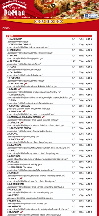
Original website
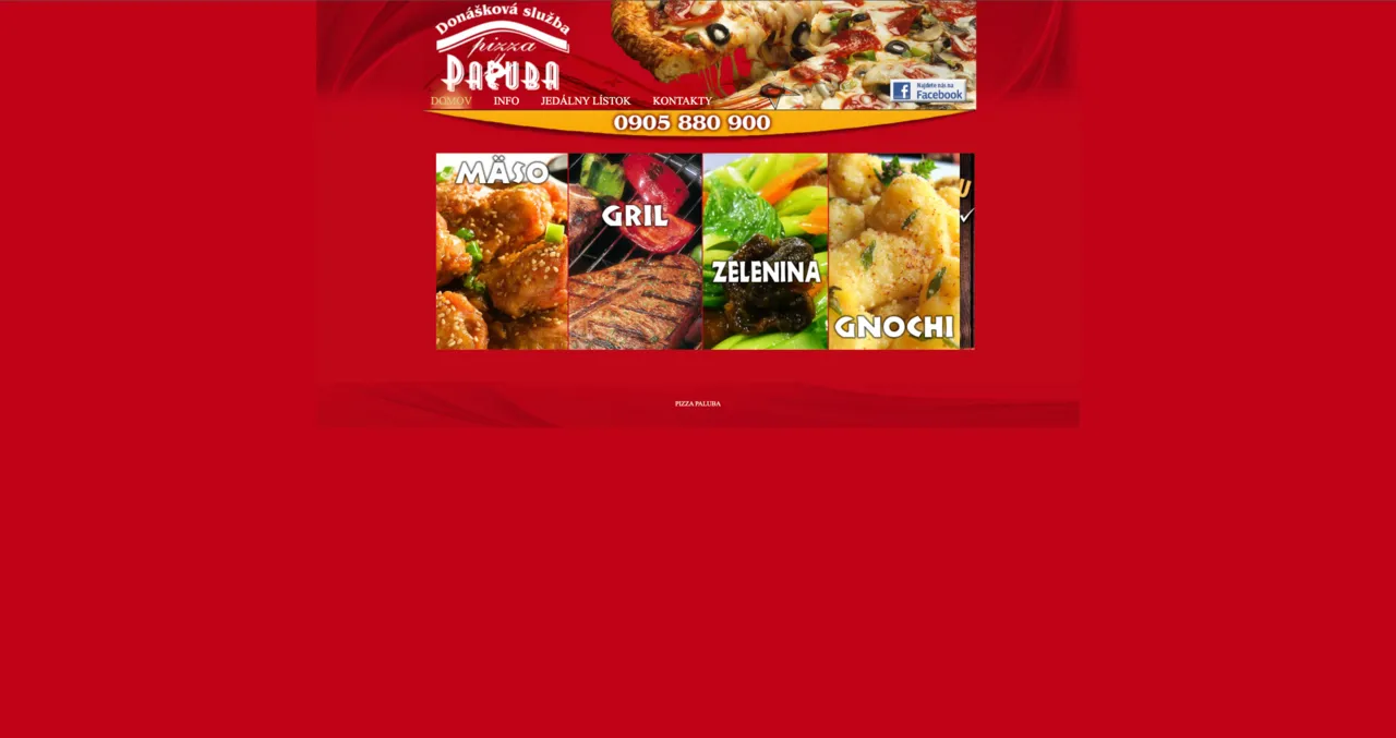
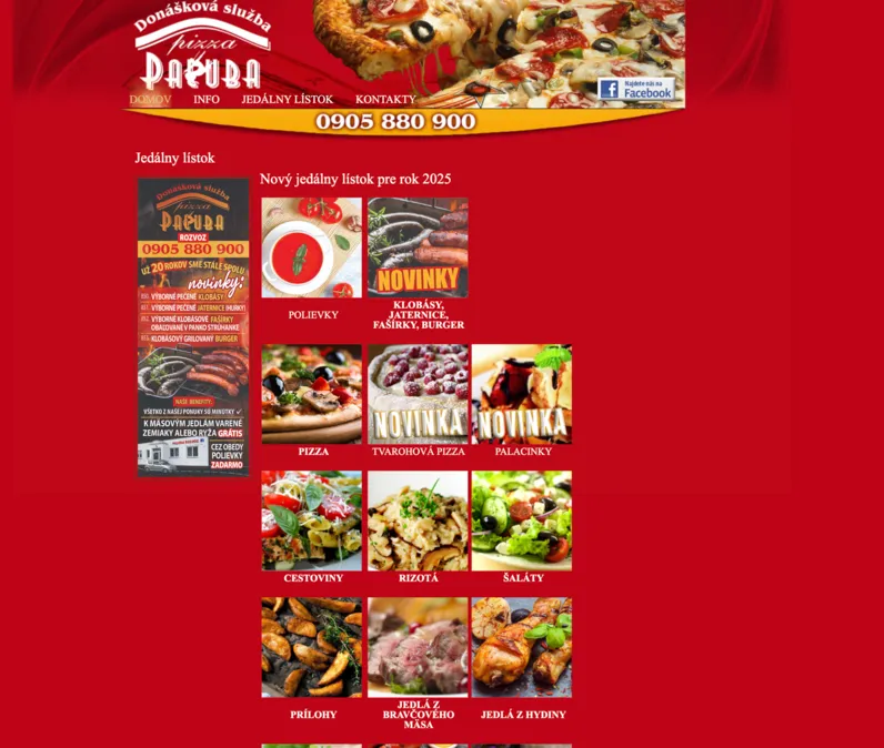
The design is very basic and outdated. The biggest issue is that on phone you can barely use the website. Other problem is that the most important part, the menu, is not even on the landing page but hidden in a subpage.
That’s what I focused on in the redesign, making the menu more accessible and the overall design more modern and user friendly.
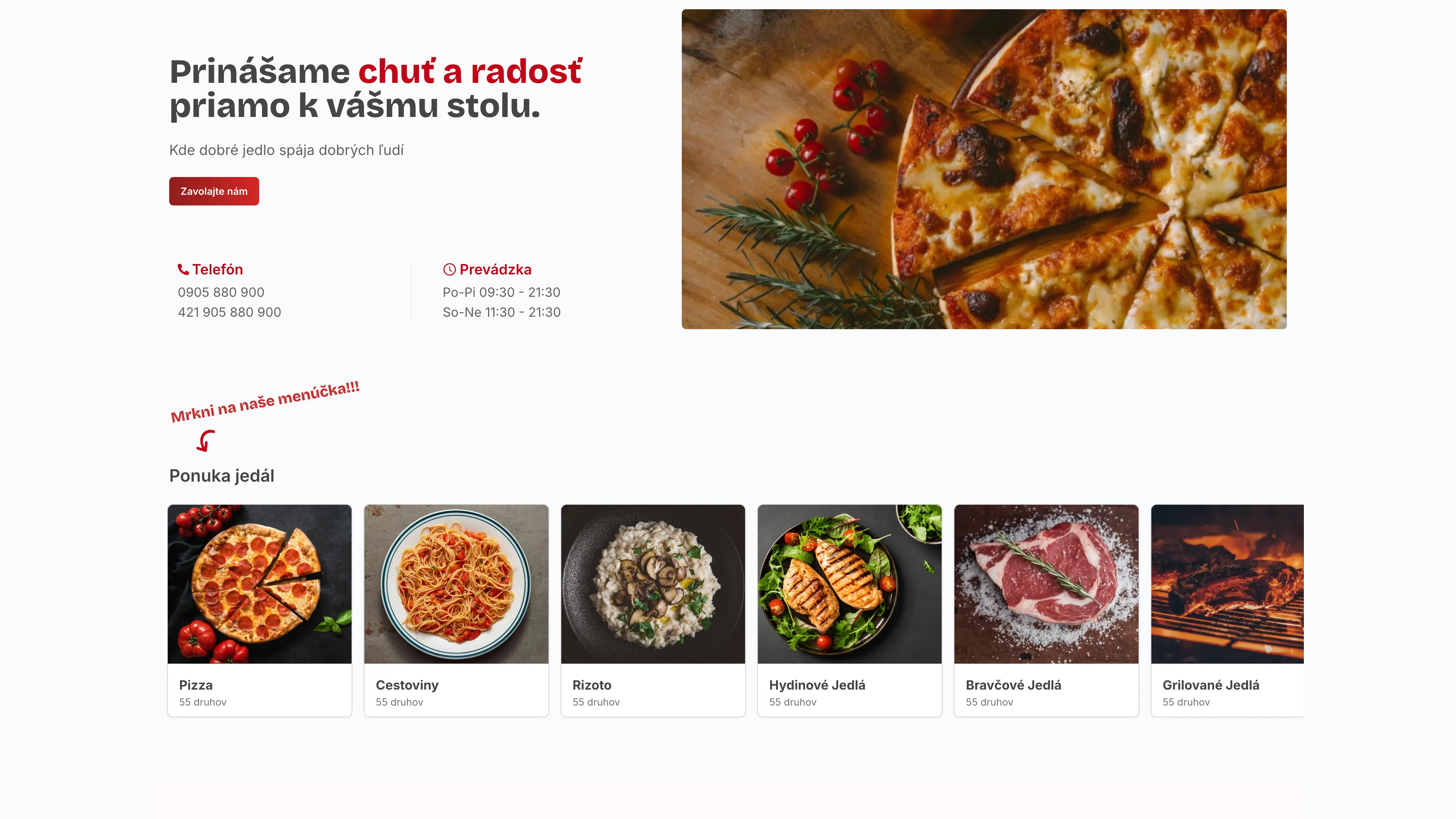
Homepage Redesign
The landingpage shows the most important information, the menu, and the rest of the content is organized in a more clear way. Most importantly since the menu is a horizontal carousel, it is very easy to navigate on mobile devices as well.
Mobile Menu Navigation
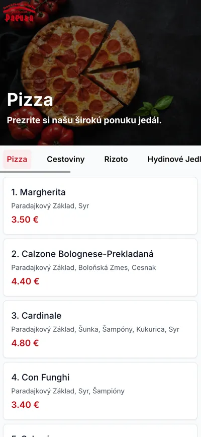
I decided to make the food layout less overwhelming and dense, with proper visual hierarchy and more breathing room. The old design had a lot of information crammed in a small space, which made it hard to read and navigate, especially on mobile devices.
Toppings Selection with prices
Another important featre that I added was easier toppings selection. In the original design, all toppings have a separate subpage with fixed prices. This means that in order to select a topping users need to stop viewing the menu, go to toppings page, remember what they can order and how much it costs and come back to menu to calculate the price and then mention it on the phone.
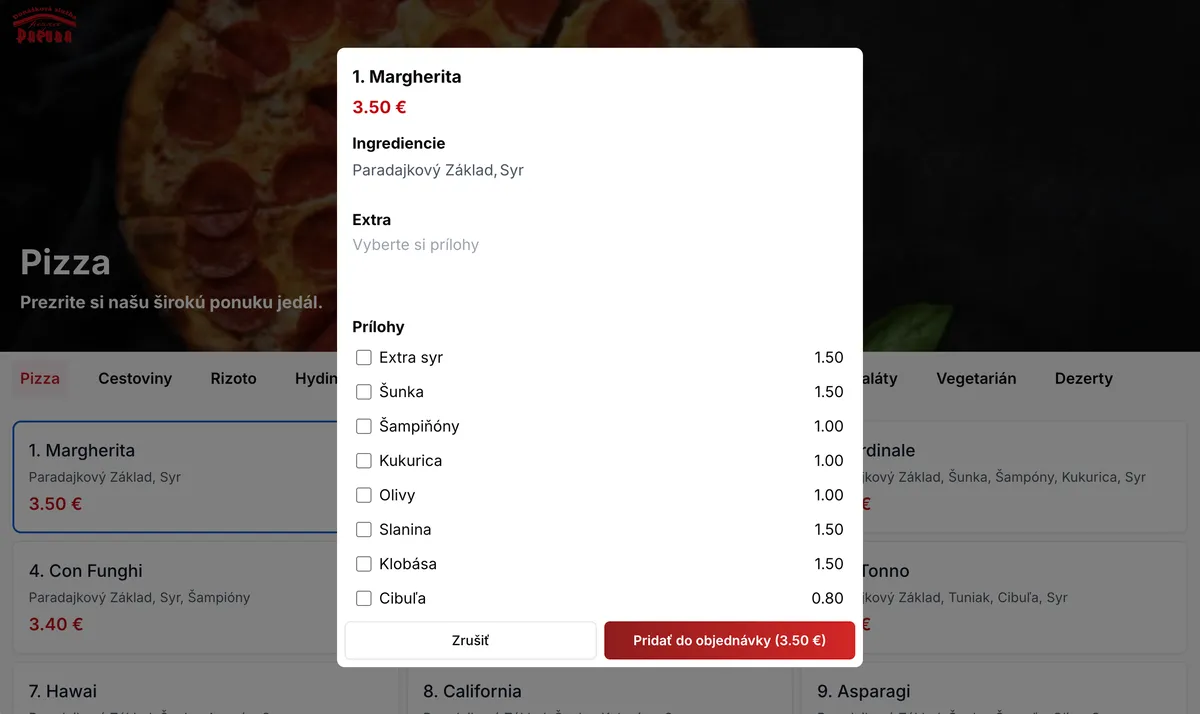
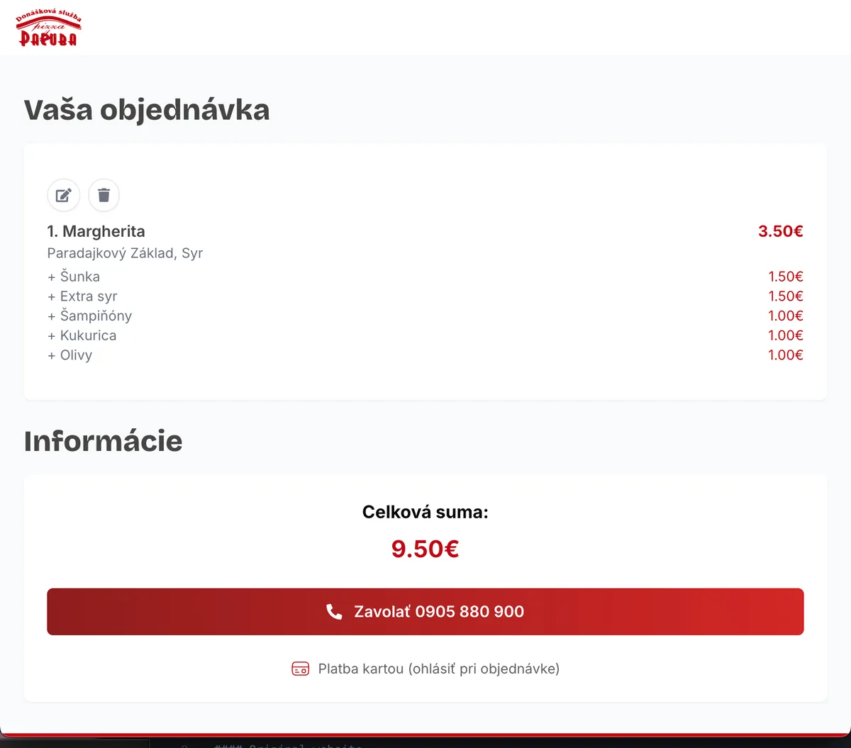
In my re-design I added a final order page that shows the total price of the order with all the selected toppings, making it easier for users to decide what to order and how much it will cost.